HGTV
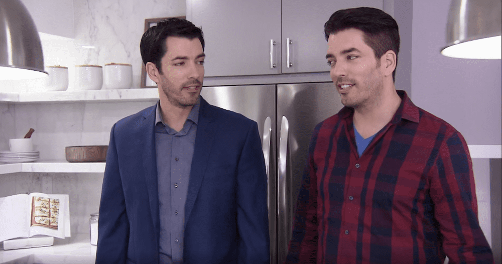
Drew and Jonathan Scott have been household names in the home renovation world for years. And while they’re known for their incredible home transformations on “Property Brothers,” they can’t always be on their A-game. Over the years, they’ve had their share of design fails, too.
As proof, just check out these home design bloopers below. Consider them warnings of what not to do to your home, and learn how the brothers typically fix these mistakes so you can, too.
Not enough storage

HGTV
Drew and Jonathan are usually good at providing lots of storage in a home. Still, there’s one place they sometimes fall short: the entryway.
In one renovation, they brought in a bench with a few drawers, then installed three pegs for hanging hats, coats, and purses. At least it was something, but the brothers could do better.
The fix: Luckily the brothers learned from past mistakes when working on another entryway with a similar layout. In this home, they installed full-length closets with a shelf, a drawer, and a bench seat for optimal storage. Much better!

HGTV
Too bland a design

HGTV
The brothers love making a living room feel warm and welcoming, but in one renovation, they left a sitting room feeling a bit stark. With a beige sofa, few decorations, and empty walls, the space felt cold and generic.
The fix: The brothers typically add tons of personality to a space, with wall hangings and shelves displaying a family’s treasures.

HGTV
Glass dining tables

HGTV
Glass dining and coffee tables have been popular in recent years—but they can give a dining space a harsh, cold look.
In one renovation, the brothers used a glass table with a built-in banquette. Yet the glass table’s corporate feel combined with the casual look of the banquette left the space feeling more like a hotel dining space than a home.
The fix: The brothers mostly stick to warm, wood-tone tables. These tables give homes a classic gather-around-the-table vibe while still being stylish. The soft colors of light woods make dining rooms feel bright, and when paired with modern chairs, they create a stunning space.

HGTV
Transitional flooring

HGTV
In one home, the brothers used a patterned tile for the flooring, which ended suddenly where the wood floor began. It was a harsh transition and, they realized, a poor design decision.
The fix: Jonathan and Drew typically choose uniform hardwood from the living room to the dining space to the kitchen. It’s a good style choice because the uniformity gives a house good flow, and avoids the awkward look of changing flooring from room to room.

HGTV
Dark stairs and railings—and carpet!

HGTV
Both carpet and dark wood can make staircases look dated, so it’s a mystery why the brothers ever combined these looks in one very strange staircase.
In this renovation, they chose to keep the dark wood steps and handrail (despite the rest of the wood flooring being much lighter), then installed a gray riser, which made the staircase look no better.
The fix: The brothers typically lean toward lighter colors. In another home, they painted the dark-wood handrail white, took the carpeting off the stairs, and refinished the wood to get a lighter color. The results were much more welcoming!

HGTV
A kitchen that’s too white

HGTV
White kitchens were all the rage once, so it’s no surprise that Drew and Jonathan caved to this trend and styled numerous kitchens with white counters, white cabinets, and white or gray backsplashes. But today, all-white kitchens can look stark and boring.
The fix: The brothers typically take more chances with their palette by installing colorful cupboards, two-tone cabinets, and fun accent pieces.

HGTV
A bathroom with too many dark colors

HGTV
These days, Drew and Jonathan know that bathrooms should be light, bright, and luxe. But they didn’t always renovate this way.
In one episode, Jonathan designed a bathroom with dark-wood paneling, a dark vanity, and dark floor tile . The space ended up feeling small and dingy.
The fix: The brothers’ bathroom designs typically feature light tones to make the space seem larger. In another renovation, they chose white walls, a white vanity, and a white counter. With a splash of color from the gold hardware and some dimension from the gray floor and shower tile, this space is lovely.

HGTV
Too much of one color

HGTV
In one renovation, Jonathan and Drew transformed a living room into a monochromatic nightmare. With so much gray, the space looked dull and flat.
The fix: The brothers usually mix up their colors a bit to add more visual interest. In another renovation, they used a lot of brown (in the form of various wood tones), but they evened out the look by adding light walls and a large, cream-colored sofa. Together, these tones worked to make the space feel relaxed, stylish, and approachable.

HGTV
Boring backsplashes

HGTV
In one renovation, Jonathan and Drew chose a plain white subway tile backsplash to go along with white cabinets, white counters, and white walls. The backsplash faded away!
The fix: The brothers know that backsplashes are meant to bring some color and personality into kitchen design. It’s a much better pick than the plain subway tile.

HGTV
Busy fireplaces

HGTV
Stone fireplaces have long gone out of style, with many preferring sleek tile fireplace faces instead. Nonetheless, the brothers sometimes left stone fireplaces as they were, as they did in this one renovation fail that keeps this home stuck in a time warp.
The fix: The brothers usually paint brick or stone fireplaces white to give it a sleek look.

HGTV
The post The Property Brothers’ Worst Design Fails: What Went Wrong? appeared first on Real Estate News & Insights | realtor.com®.
source https://www.realtor.com/news/trends/property-brothers-worst-design-fails/
No comments:
Post a Comment